The electronic capture of detailed delivery data can have multiple benefits for your business. In addition to removing paperwork from your delivery operation and enabling real-time transmission of proof of delivery data to office-based teams, electronic data capture also makes reporting quicker and easier.
To enable trend analysis and performance management of your delivery teams we have developed a reporting dashboard within the fleXipod central management console to display key reports at a glance.
Initially, the reports available will cover three key data sets:
Once you have selected the data set you wish to view, it is then possible to filter by timeframe, choosing to view data from today, yesterday, this week, last week, this day last week and, using the trend graph option, the last 28 days or the last 52 weeks. You will also be able to view data for your full operation, compare multiple manifest groups (user groups e.g. depots, service teams etc.) or view individual manifest group data.
Here are some useful examples of how you can use the new reporting dashboard:

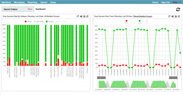
Using the graph on the left you can compare performance of manifest groups over time to allow you to better manage or set targets for individual depots. Using the graph on the right you can view drop success trend data, identifying any potential days of the week when failures occur more frequently than usual.

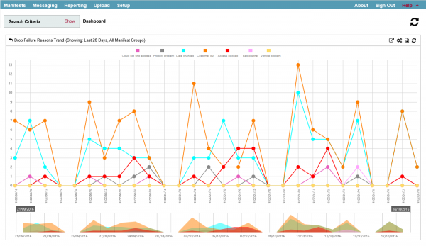
You can also monitor common failure reasons and identify trends across the month or year. By clicking on the key you can easily edit the view.
Get in touch with our experienced team to learn how the fleXipod proof of delivery system can help your office-based teams manage and monitor your delivery operation.